The word "gimmicky" didn't just name a perception problem—it broke a deadlock. Once the team agreed the brand needed to look more serious, the decisions happened fast.
A unified design system came first—typography rules, imagery guidelines, component patterns—built to reproduce consistently across web, print, conference materials, and onboarding. Templatized assets cut execution time—a small team of four couldn't afford to design from scratch every time.
Rather than replacing the typeface, the team shifted the header system—larger, bolder titles that turned descriptions into statements. Two-color headers created visual rhythm. The brand started to carry more weight without changing its voice.

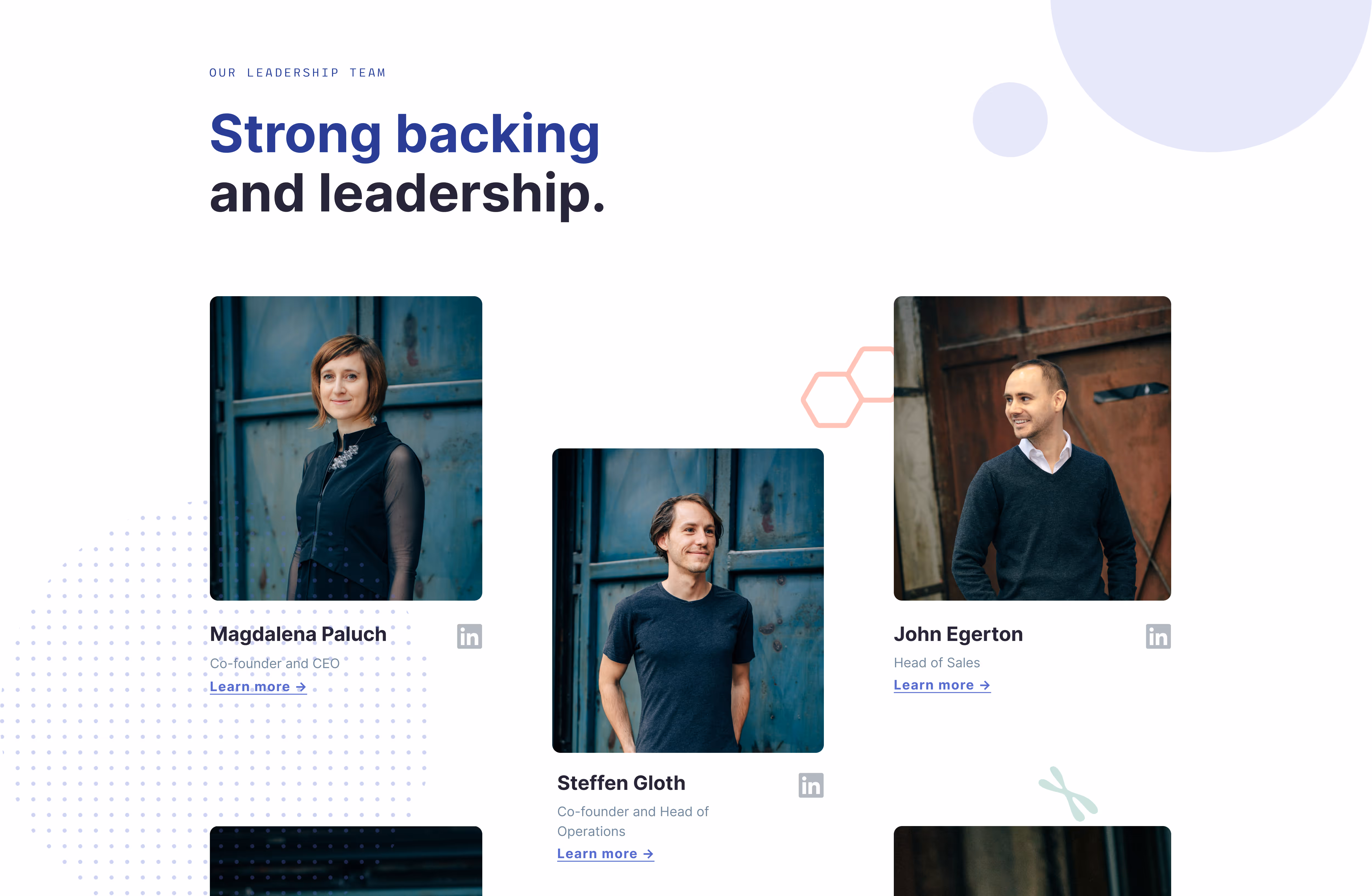
Imagery required a harder call. LabTwin had relied heavily on custom illustrations—what worked when no product photography existed. The illustrations communicated warmth and originality. Scientists connected with them, but decision-makers didn't. They needed proof of concept, not just a concept. The team had sensed this, research confirmed it. In user testing, photography consistently scored higher on credibility. Illustrations stayed in scientist-facing materials. Photography took everything else—moving the brand from visionary to a real product.

The website was restructured as a conversion system, not a collection of pages. Each audience got a coherent path: scientists to onboarding, managers to social proof and validation, decision-makers to ROI. The navigation got the same treatment. Login and "Schedule a demo" had equal visual weight—two different jobs competing for the same attention. Login moved to a sticky banner at the top; the site's one job became driving new leads.
A prototype test surfaced one unexpected finding: the language—"scientist," "capture data," "sync your data"—was being misread. Visitors assumed LabTwin was a tool for data scientists, not lab scientists. Photographs of scientists in actual lab environments and scientific icons (chromosomes, DNA, blood cells, etc.) resolved the confusion.

Physical touchpoints were rebuilt around two simple logics: either generate a lead or bring more users on board. Conference materials were designed to give curious visitors a reason to stop without needing to be approached. Business cards carried QR codes straight to a demo and a meeting calendar. Every touchpoint had one job—so every lead could be traced back.


Welcome kits were made visible and reusable— brand-colored boxes with a printed prompt inviting scientists to keep them in the lab. Nothing spreads a product in a lab faster than another scientist already using it.