The audit
With the payment working, attention turned to increasing the conversion. An audit of the existing paywall revealed several compounding problems.
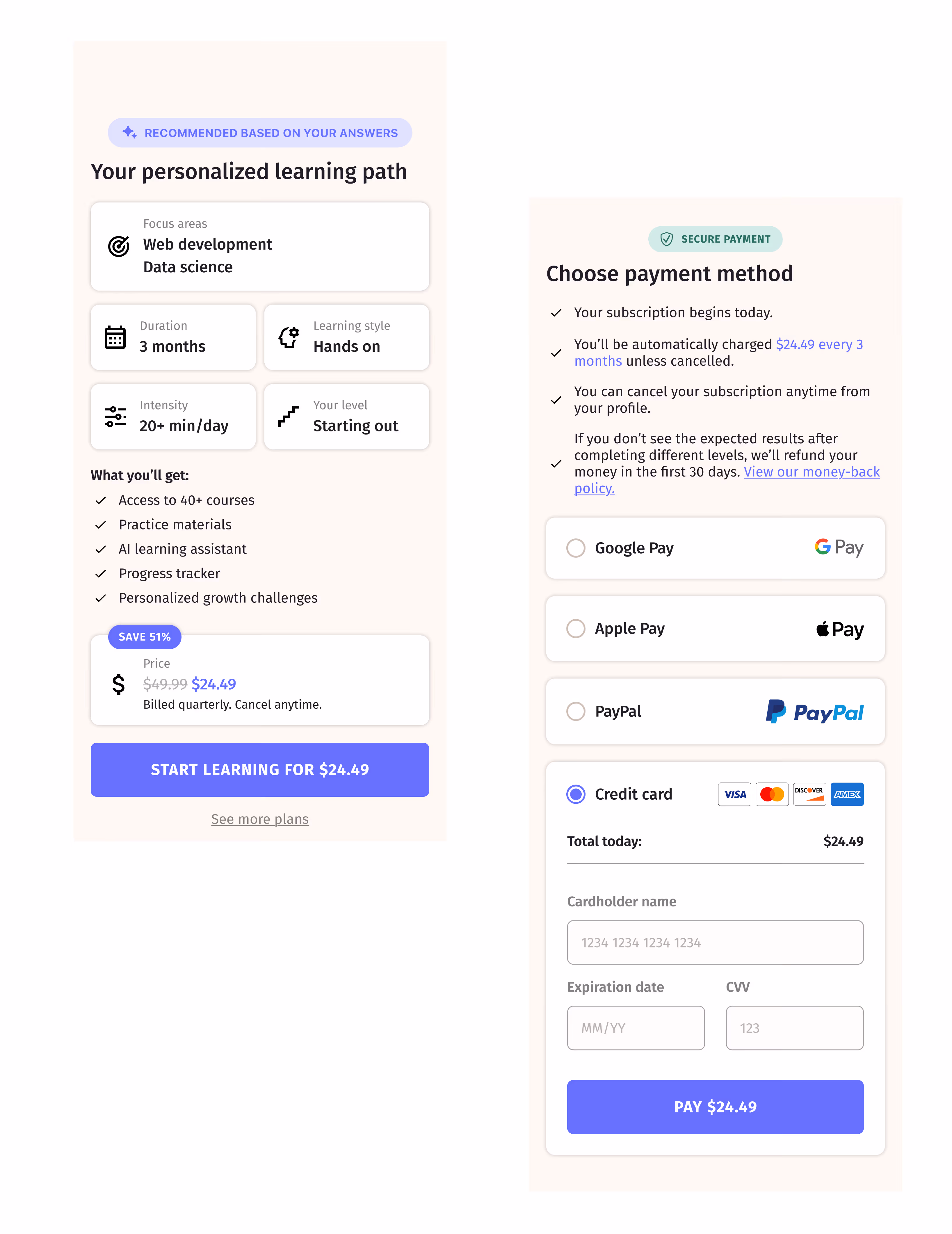
The payment screen landed viewers directly on payment plan selection—no summary of what they'd chosen during onboarding, no context for what their subscription would include. After investing time in 30 questions, viewers got a screen that didn't acknowledge any of it.
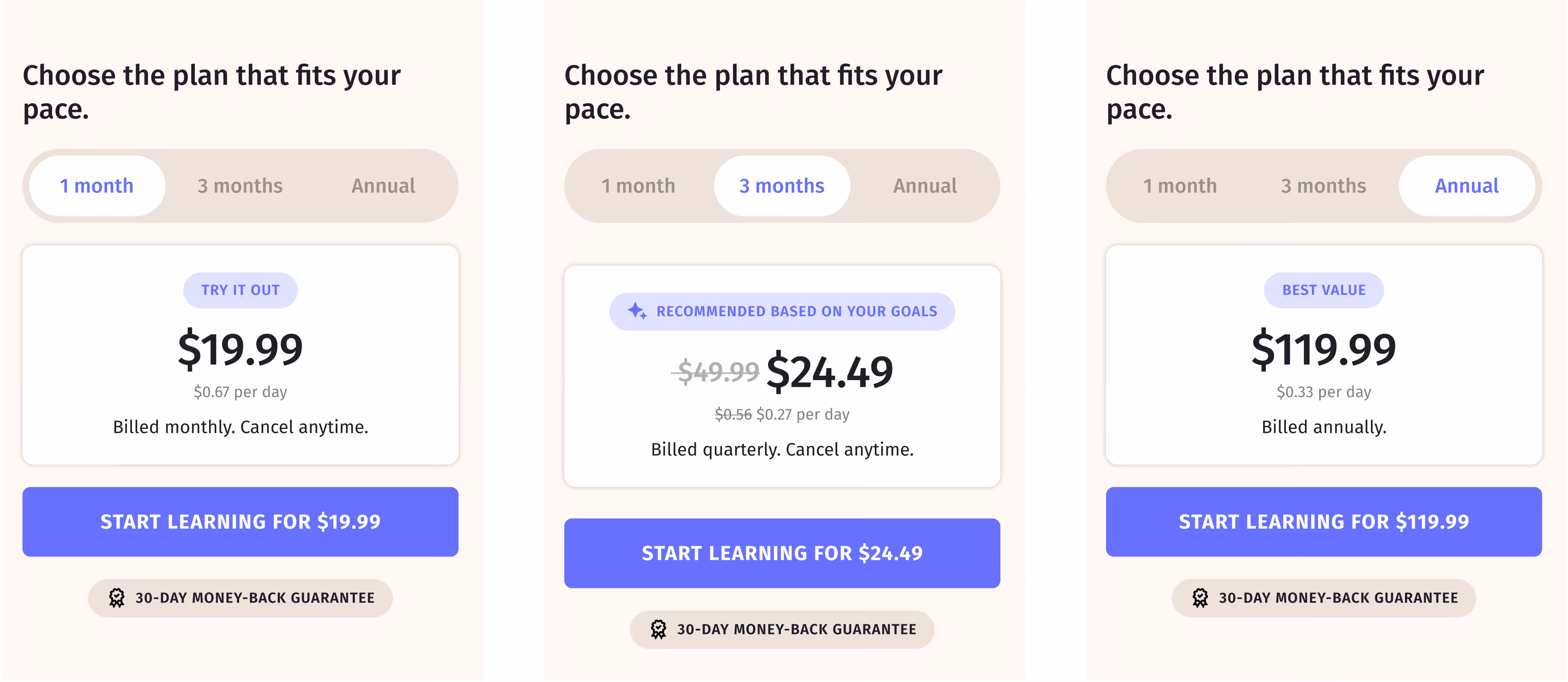
Pricing was structured around a daily rate—$0.33, $0.27, $0.16 per day—but the actual charge was for the full period. A viewer seeing "$0.27 per day" would need to calculate what 3 months actually costs. Every plan showed the same 51% discount. The hierarchy made the small number salient and the real price tiny—too much arithmetic for what should be the simplest step.
Behavioral data told a clear story. Of 113 paywall viewers, 62% scrolled to products, 51% to the value section, but only 15% reached checkout. FAQ had a 7% click rate—low enough to question whether it belonged on the page at all. Discount clicks sat at 10%. The elements designed to persuade weren't doing their job.